top of page

ree

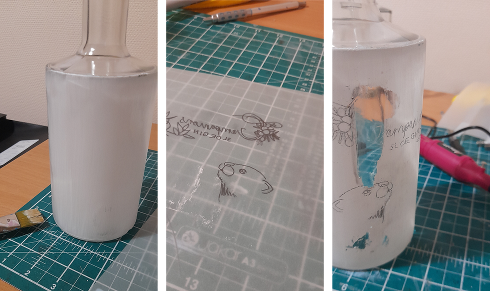
The first step was to paint all four bottles with a thin white layer of acrylic paint. It needs to be thin so that it is easy to etch through, and being a thin coat makes it easier to wash off.


ree

To trace the designs, they must first be reversed. I then outlined the important features of the branches, otter and typography onto tracing paper.


ree

Wrapping the tracing paper around the bottle meant I could make sure everything was lined up and in the correct position. Once happy with the positioning I taped it in place and sketched over the lines to trace them onto the bottle. I did this for all four bottle designs.

This came out really well on the white paint, making it easy to see, and setting the bottles up for the etching process.

By tracing the images like this I was sure that the proportions would all be correct and the typography would be as accurate as possible.

Transferring the designs to the bottles is a challenge as it's not as simple as just using some tracing paper! I could freehand the designs, however, I want the designs as accurate as possible, especially the text, as I need it to be the same on all four bottles.

Tracing paper does not work as the pencil does not transfer to the glass so the design cannot be seen.

Tracing paper does however work on a painted surface. I decided to paint a bottle with a thin layer of white acrylic paint. I could then trace and etch the outline onto this and then wash off the paint after the outline has been etched on as the paint is not waterproof. This then leaves a clear surface to etch into.

ree

I have found this to be the best solution to the problem. Since then I have also discovered carbon tracing which may work better and eliminated the steps involving painting the bottle. If there were more funds for the project then this may have been a good way to go.

MA Design Blog

bottom of page