top of page

ree

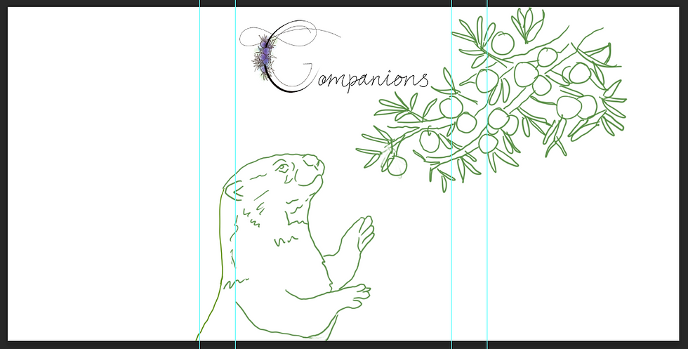
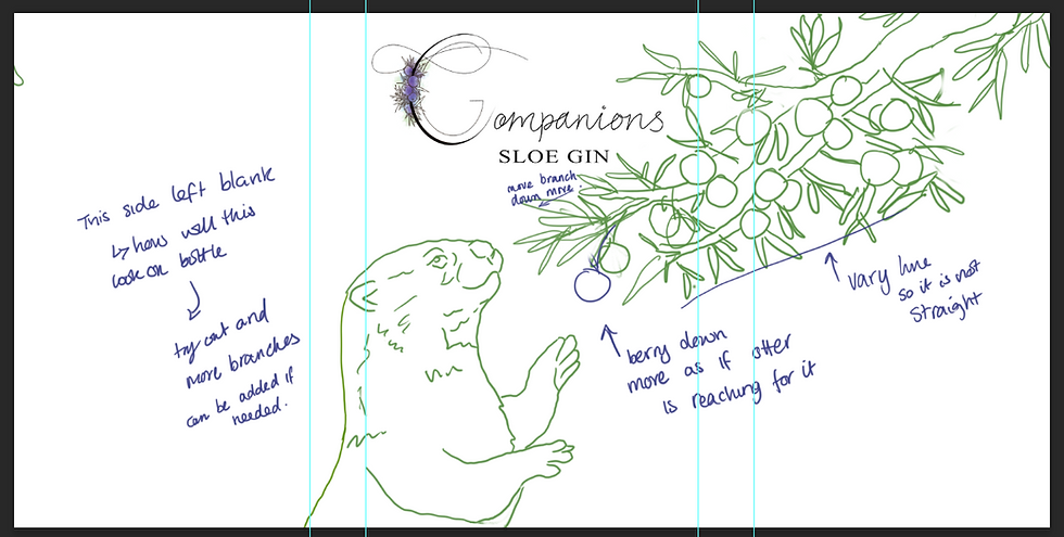
I kept the layout of Juniper Gin similar to Sloe Gin as the two designs work well together, with the otter in a similar stance.

ree

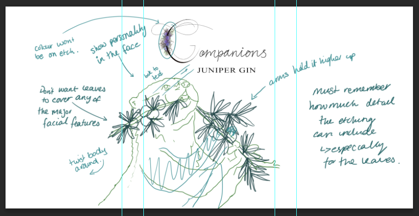
I didn't like how low down the arms are on the otter and how it looks like it is pulling at the branch. I moved them up so the branch placement works better and moves the eye around the page. The face will show the otter's personality.

ree


ree

After sketching out the layout I noticed some things that didn't go right - such as the branch and 'C' not fitting well together. To fix this I decided to take the components into photoshop and move them around to find the best fit.

ree

I found the fit works much better with the illustration flipped as the branch and 'C' are no longer fighting for the space.

ree

I looked at the direction the illustration and text would take you around the bottle, using the otter's line of sight and the shape of the branch to move the viewer's eye.

ree

I realised I forgot to include the 'Sloe Gin' text within the design so I added this which meant moving the branch around a bit. I also elongated the branch so it would go off the top of the bottle rather than stopping mid-space.

For the final design, I will hand draw this using biro pen rather than sketch it in pencil. This is because I can get a closer finish to etching with pen rather than the gradients you get when using pencil.


MA Design Blog

bottom of page