top of page

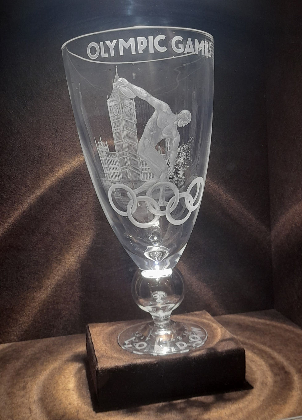
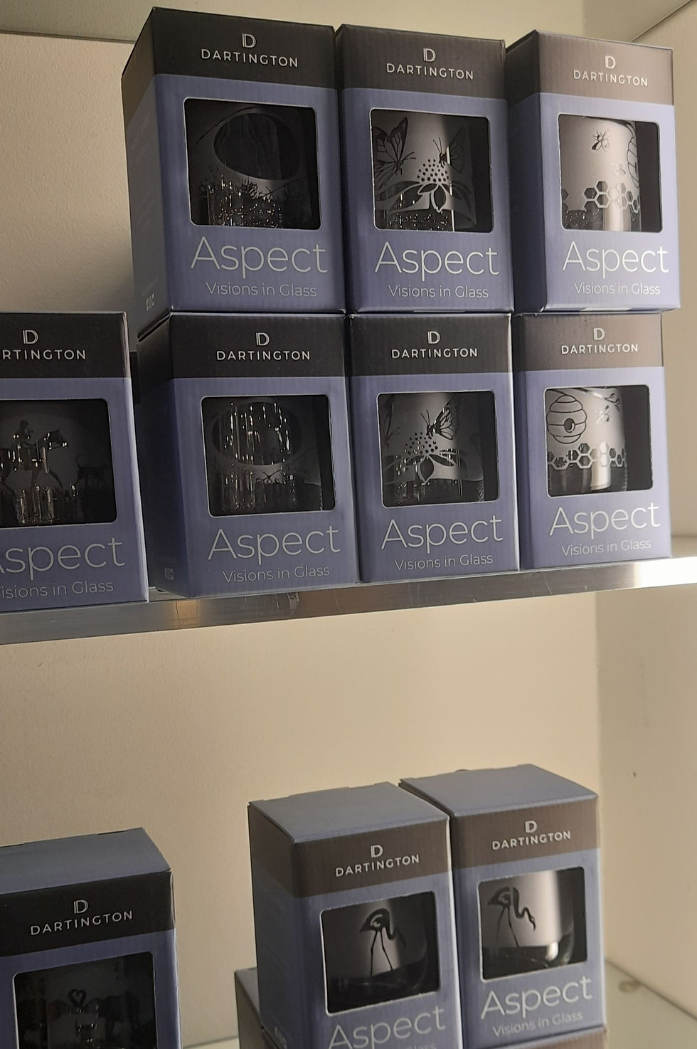
After looking at the etching done at Dartington Crystal I saw how the look of the illustrations changed depending on what was on the back of the bottle.

I need the text to be easy to read and stand out, therefore it has to be bold while also being the right size to be fully readable from the front of the bottle.

ree

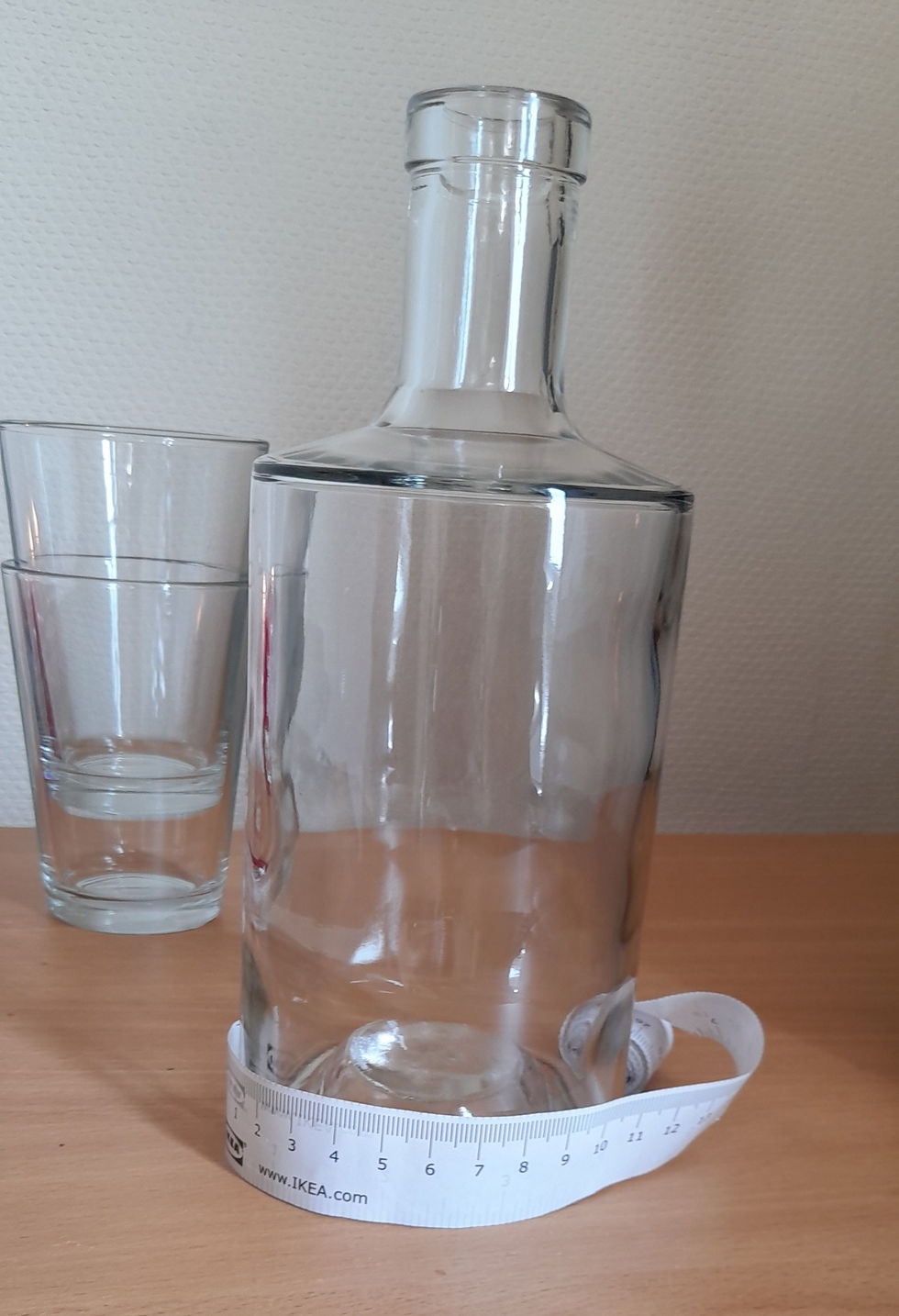
I took the measurements of the bottle, placing them onto a flat surface so I could see the template I've got to work with for both the text and illustration. I have decided not to include the neck of the bottle in this template.


Proportions:

height total = 146mm

height (not including ridges) = 139mm

circumference of bottle = 280mm

Visible front area (including curve) = 120mmx139mm

visible front area = 90x139mm

ree

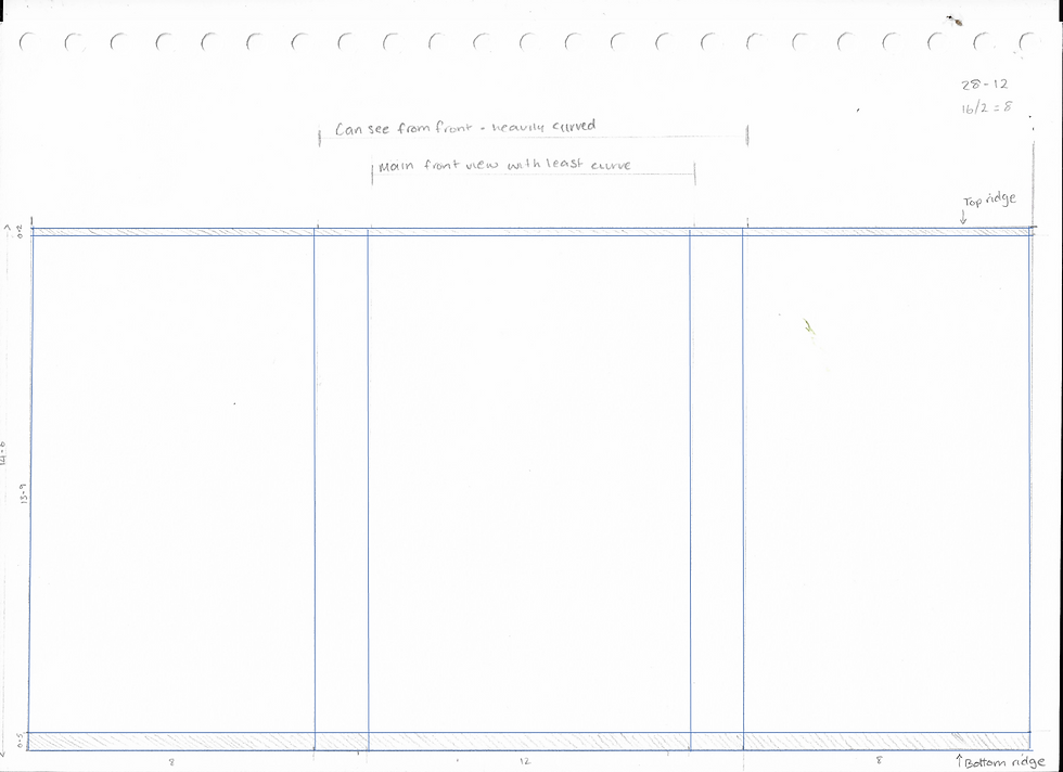
The text and main details should stay in the visual front area, whereas the illustrations will be able to go across the visual front area (including curve) and break the grid. I will need to test the etched design layout with both the lighting and liquid to see how they fit. Once I know what works on one bottle the proportions of the other three should be very similar.

I have eight gin bottles in total to work with. Four of these will make up the final presented designs and at least one other should be left in case of damage or large etching mistakes. This leaves three bottles for layout experimentation and development. As well as the Gin bottles I have other glasses to practice the process of etching on and build my confidence using the tools.

Dartington Crystal is known for its hand-etching by Nick Davey who is a Master Engraver. He can achieve a great level of detail within the etching.

The photo below is a commissioned piece for the London 2012 Olympic Games. Only 48 pieces were produced and these sold out before the games had even started.

what I find fascinating about this design is how the etching is done on both the back and front of the glass. This gives a three-dimensional perspective as the infamous London landmark (Big Ben) is in the background whilst the Olympic Rings are in front. The shape of the glass means that it has an interesting perspective.

ree

Having the etching going all around the glass works in some cases and not in others. With the leaves and vines, it works really well as the vines overlap giving the three-dimensional view. However, this would not work so well with text and some detailed illustrations as there would be too much going on meaning the important elements would be lost.

ree

Nick Davey has a workspace set up in the view of the public who visit Dartington Crystal. This allows people to see how he etches, and the process it takes. On his desk you can see some of the things he is working on. Some are hand etched on a plain glass, whilst others have been sandblasted first and then etched onto after giving another dimension to the finished product.

ree


Dartington Crystal introduced me to the process of sandblasting, which looks similar to etching but is a process that can get the same results every time.

Sandblasting leaves two tones to the glass - the transparent untouched glass and the translucent sandblasted areas. The process of sandblasting is shown in the photo below taken at Dartington Crystal.

ree

ree

This photo shows some of Dartington's finished products which have been sandblasted. You can see that an identical illustration can be produced repeatedly using the stencils.

Hand etching is great for producing bespoke products and showing how the bottles I'm designing will look. However, if the bottles I am designing are to be mass produced, or even batch produced sandblasting may be the best way to create the design. It would reduce the production time and human error which is the downside to hand etching.

MA Design Blog

bottom of page