- 0 min read


Xavier Baker and Conrad Gauntlett are the owners of The Isle of Wight Distillery and redesigners of their Mermaid Gin bottle. They developed it from a simplistic design to a unique bottle. The aim of the new bottle was to be manufactured from sustainable and recyclable materials as this keeps up with current trends by acknowledging the climate crisis' impact on packaging design.
A huge amount of thought was put into the new design, looking into the product's name, culture and environment to create an eye-catching bottle that is completely different from its competitors and stands off the shelf.
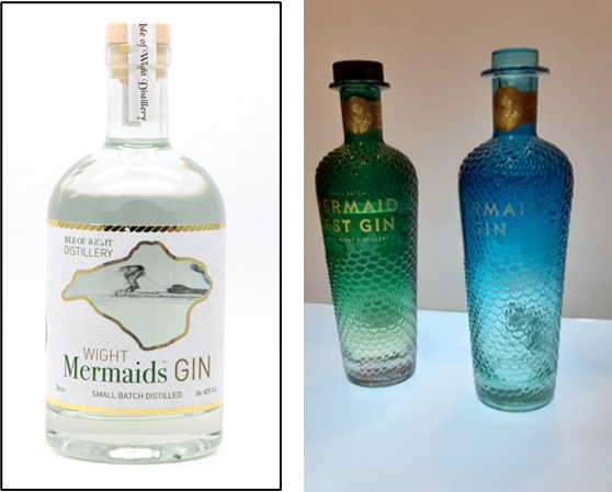
Looking at how this distillery went from a small business with easy and cheap to make bottles, to a mass-manufacturing business which had the money and desire to create a unique bottle shape has inspired my designs.
I am aware the company I am creating the bottle design for does not currently have the money for an extravagant and unique bottle shape, therefore I must work with an existing bottle shape and make the labelling the part which is unique and eye-catching. This is not to say that later down the line, if the business is doing well they may want to invest more into the bottle designs to make the shape unique. This is where the sculptural ideas in my first designs may come into play.
As well as the name and imagery on the bottle there will be other information needed such as the alcohol content and awareness, barcode, and details the producer wants on the bottle.
Looking at other gin designs the labels are normally small and don't take up much of the surface area of the bottle. They are often located on the back of the bottle.
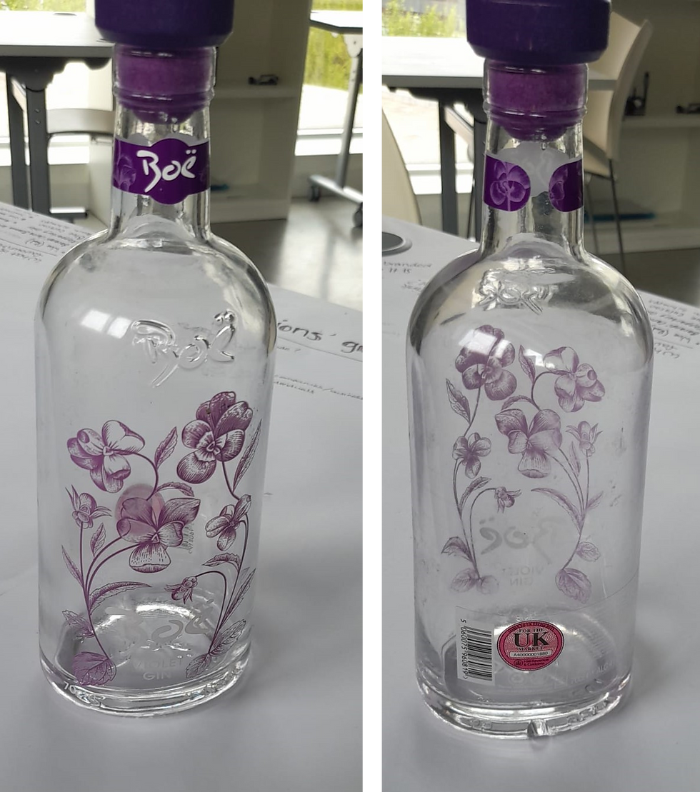
Boë gin is a good example of this and relates well with how I wish to design my bottles. The information is on a clear sticker on the back of the bottle leaving space for the illustration and name to be placed on the front. The label can be seen (but not readable) from the front when no drink is in the bottle - however, it is important to remember the gin in this bottle is not translucent and has an iridescent look to it - so you won't be able to see through the bottle.

Gordon's Gin label is similar but on a white sticker instead of a clear one. When the customer looks at the bottle from the front they only see the white of the label and not all the information; therefore the information does not take away from the design of the bottle.